azure

Although very rarely occurring in nature without human intervention, the colour blue has for centuries been source of complex fascination, in particular for artists. Difficult and expensive to procure, the colour blue as we understand it after years of alchemy and collective socialisation, was seldom seen outside the clothing of royals, religious figures, and otherwise wealthy elites, in medieval and renaissance art, and even then, sparingly.
The pigment used to create blue paint was derived from the semi-precious stone Lapis Lazuli, which began importing at great expense from a region in northern Afghanistan, primarily into Egypt. The scarcity of the colour quickly established blue as a symbol of not only material wealth, but also spirituality. Even as synthetic pigments began to make the pigment more accessible, blue retained its status as a powerful, expressive, and elemental colour, playing a central role in art history, and most notable, abstract art.
Egyptian blue, the first colour to be synthetically produced, was first created in Ancient Egypt around 2,200 B.C. To create the hue, Egyptians combined limestone and sand with a copper-containing mineral like Azurite or Malachite, and heated the solution resulting in an opaque blue glass. The difficult process was easy to get wrong, and could result in a ‘glassy, green mess,’ explains Victoria Finlay in The Brilliant History of Colour in Art (2014).
From the beginning of the 20th century onwards, the road to abstraction was, for many artists, paved with blue. French artist Henri Matisse was at the forefront of the development of avant-garde art, his Blue Nudes a testimony to the importance of the colour in his work. The images, amongst the most iconic works of early 20th century art, consist of a series of female nudes, recognisable though partially abstracted; rendered in blue paper pasted onto a white background. Working in a way that the artist termed ‘cutting directly into colour’, by choosing a single colour for the piece, Matisse reduced the works to their most powerful and elementary form.
“We built division, separateness into the world; the very fabric of society. We can build inclusion back in. Belonging, by design.”
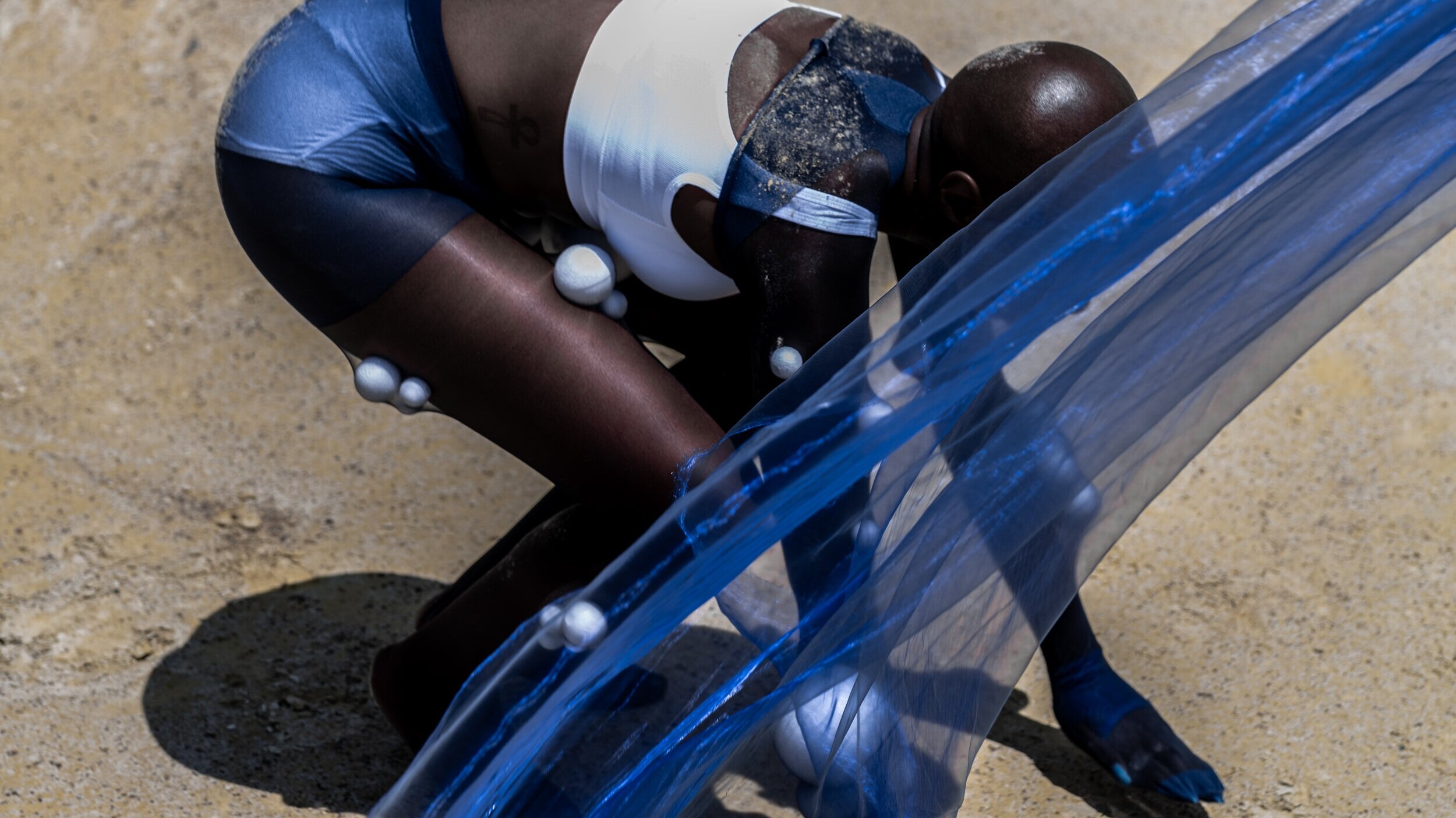
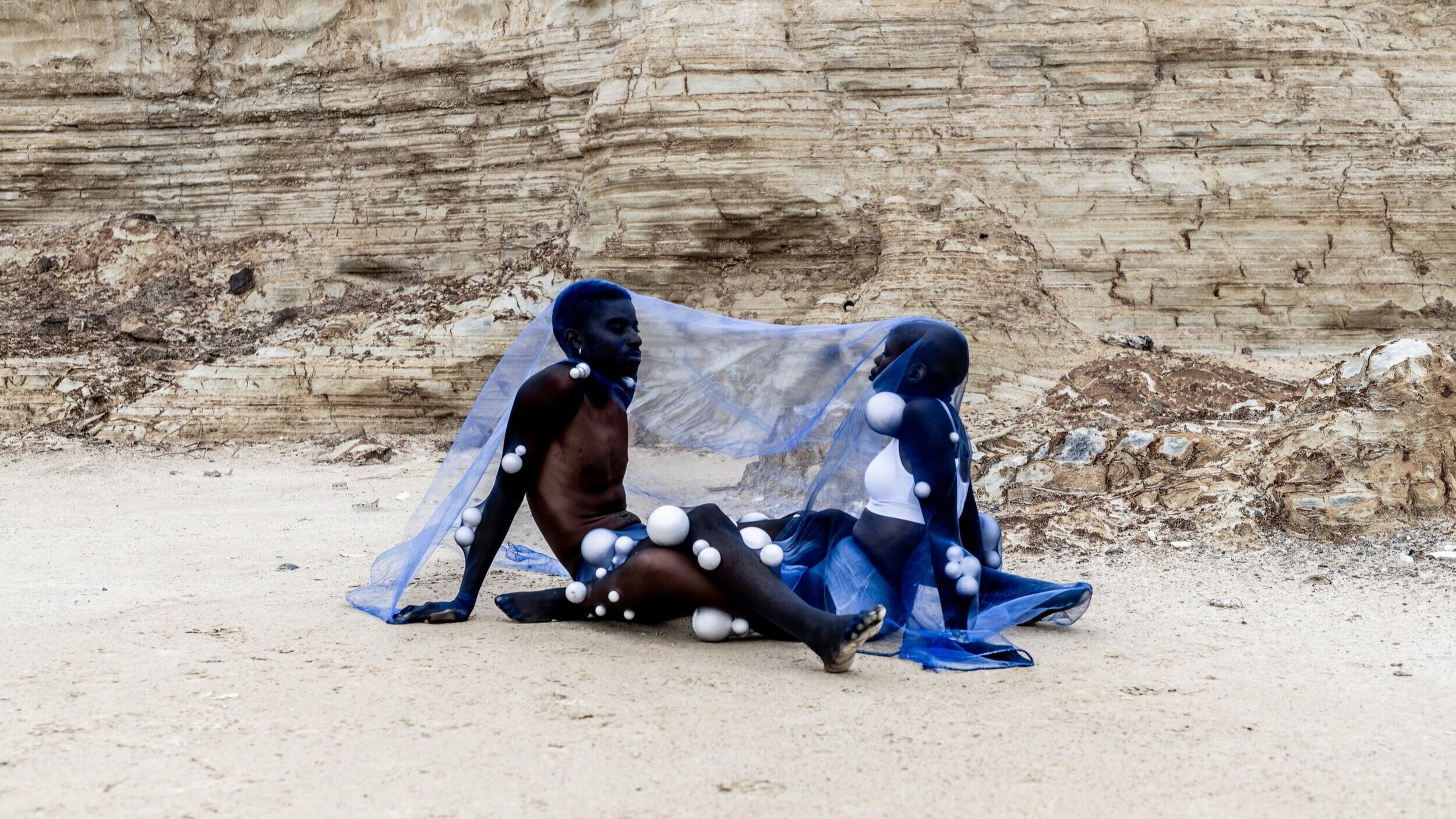
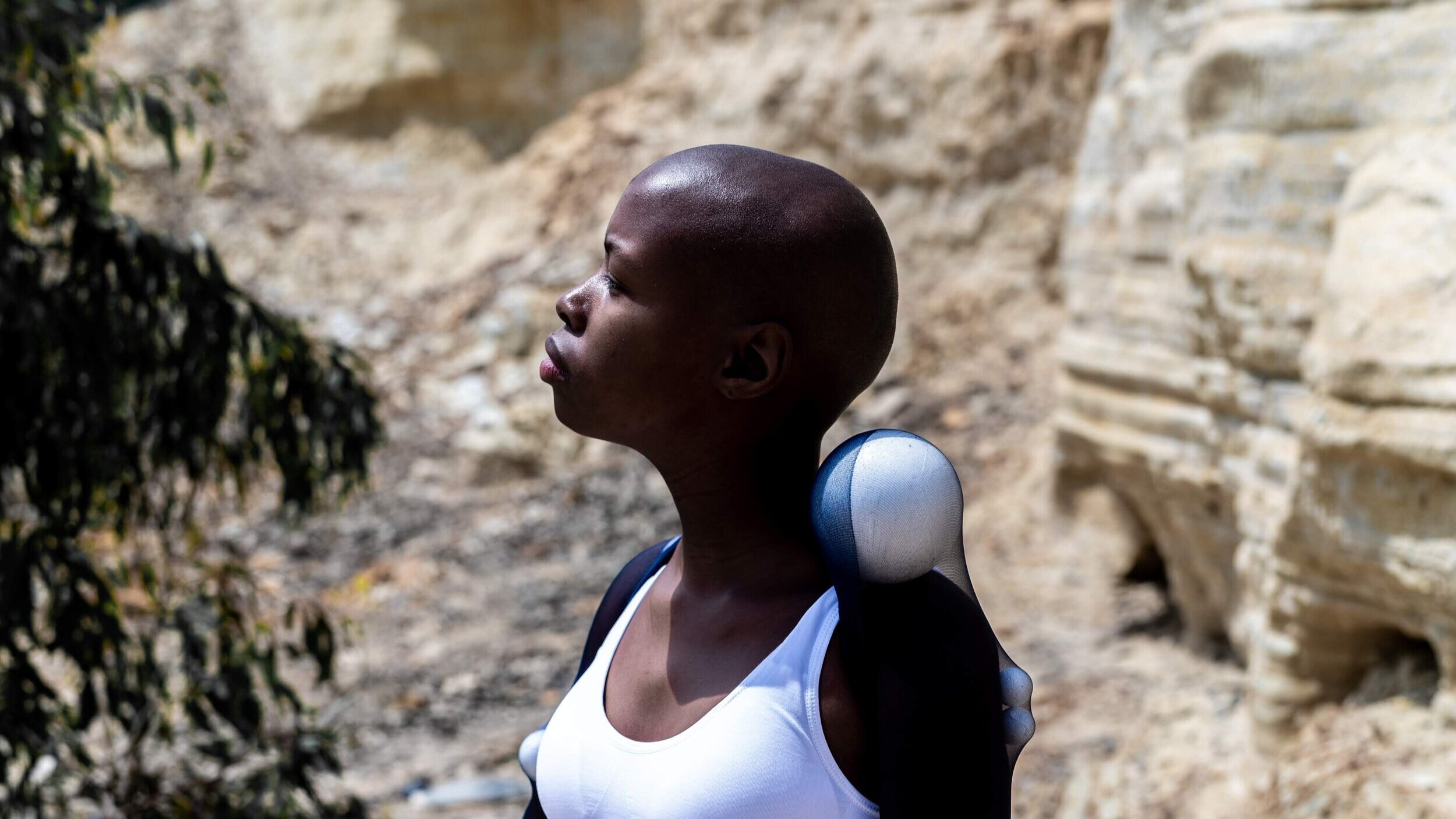
Later, the colour blue took centre stage once again, through the work of French painter Yves Klein. Klein, whose career was defined by his preoccupation with colour in its purest forms, pushed the limits of artistic creation with the fabrication of his first fully monochrome canvases in 1947. These works, defying artistic convention, were originally created in a full range of colours, however the artist became increasingly fixated on finding a particular shade of ultramarine blue, which he believed would capture the quality of pure space. Once he developed the perfect shade, known as IKB, or International Klein Blue, he patented the colour, and went on to produce around 200 canvases painted with the shade, going so far as to paint nude models with the colour and instructing them to roll around on a canvas to create abstract and highly expressive compositions.
An oft-recounted story about the 19-year old Yves Klein basically sums up the artist’s entire approach to his work. The story goes Klein was sitting on the beach one day in 1949 with Armand Fernandez (who became the artist Arman) and Claude Pascal (who became a world-famous composer). The three had traveled Europe together and become close friends. While sitting in the sand staring out at the water, they decided to divide up creation between them. Claude Pascal is said to have chosen words; Armand Fernandez took dominion over earth; Yves Klein selected for himself ‘the void,’ the ‘empty, yet not empty’, space that surrounds the planet. Klein allegedly then reached his finger out and signed his name to the sky. The essence of his beach declaration, to ‘explore not only what’s perceptible, but also what appears to be absent, and to assign equal importance to both’.
‘Blue has no dimensions. It is beyond dimensions,’ he once said.
Inspired by Klein, the filmmaker and author Derek Jarman created the moving picture Blue (1993), which projected the same shade of ultramarine blue for 75 minutes, punctuated by a haunting soundtrack of ticking clocks, choral singing, and poetry and storytelling recited by Jarman himself. For contemporary artist Roger Hiorns, the colour blue continues to lead the way in the realm of boundary-pushing non-figurative art. A former council flat in London was the canvas for his blue masterpiece, Seizure, created by covering the small building with copper sulphate solution, where striking blue crystals were then allowed to form over every surface of the space. The piece, which was nominated for the Turner Prize in 2009, demonstrates the enduring power of the colour in contemporary art.
Whether a symbol of spirituality or material wealth, sadness or strength, space or emptiness, there is no doubt that the colour blue has served as inspiration for artists throughout the ages. Leaving a lasting mark on the history of abstract art, the once precious shade has been democratised but not diluted; its elemental power and expressive potential providing inspiration to artists from Mondrian to Malevich, Kandinsky to Klee, and Picasso to Pollock.
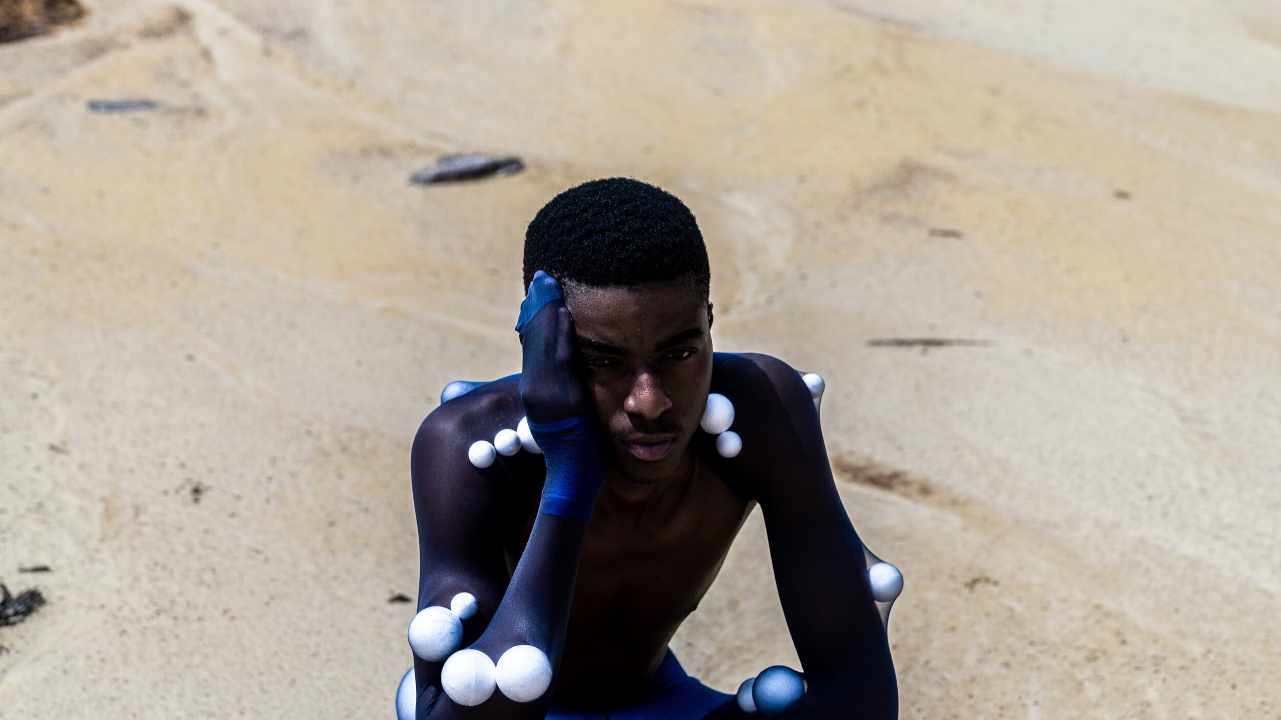
Made by Many
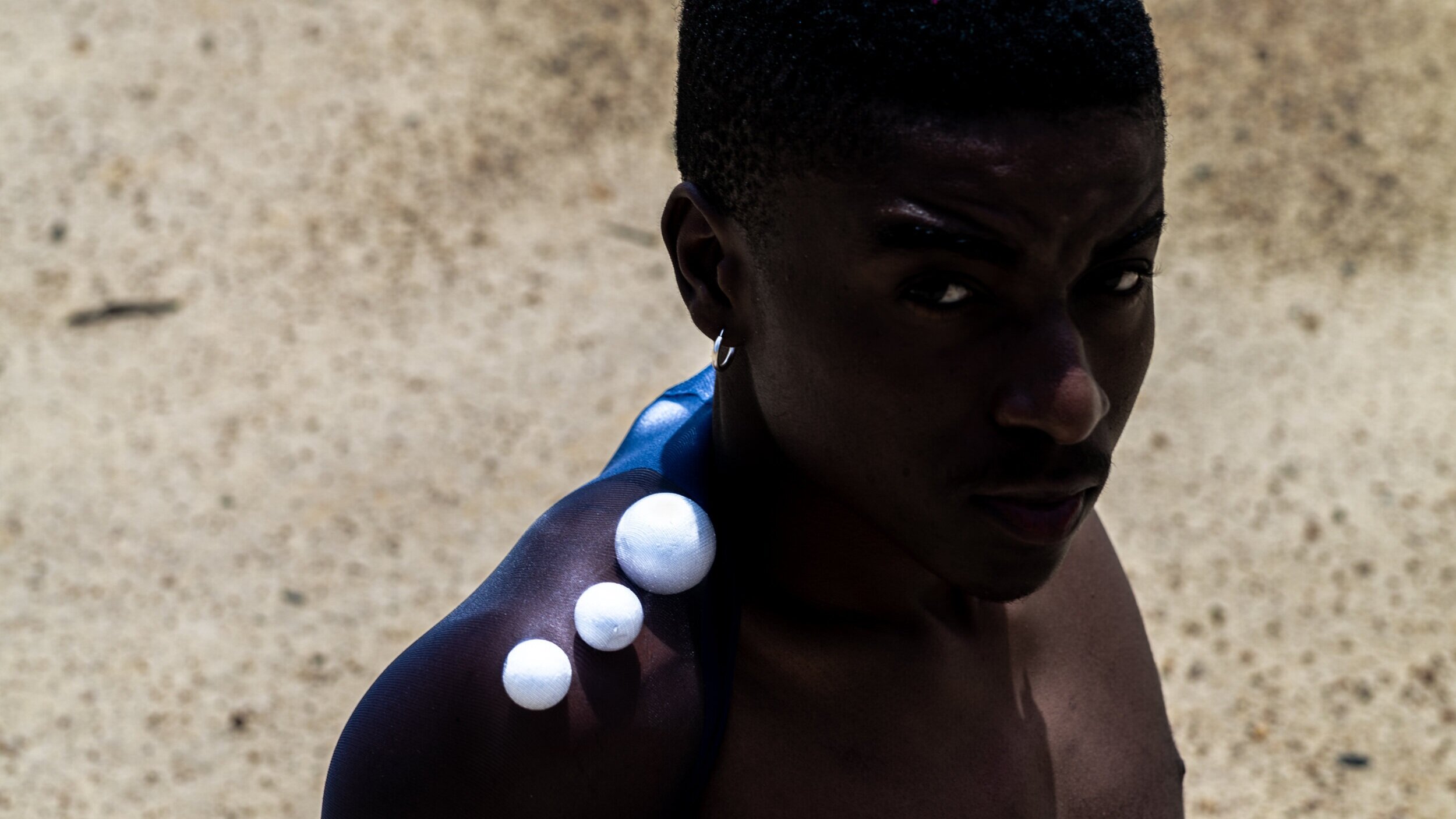
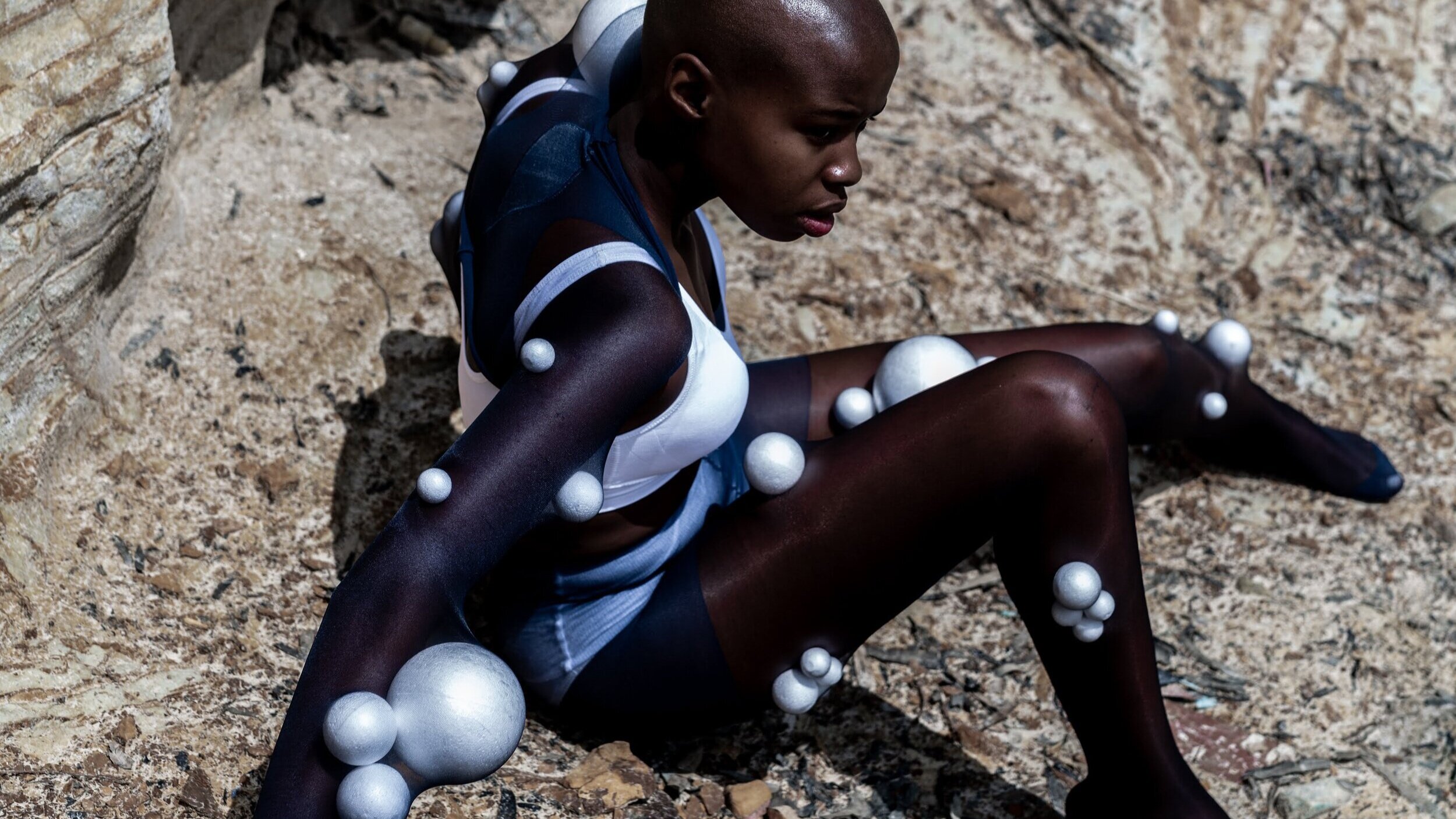
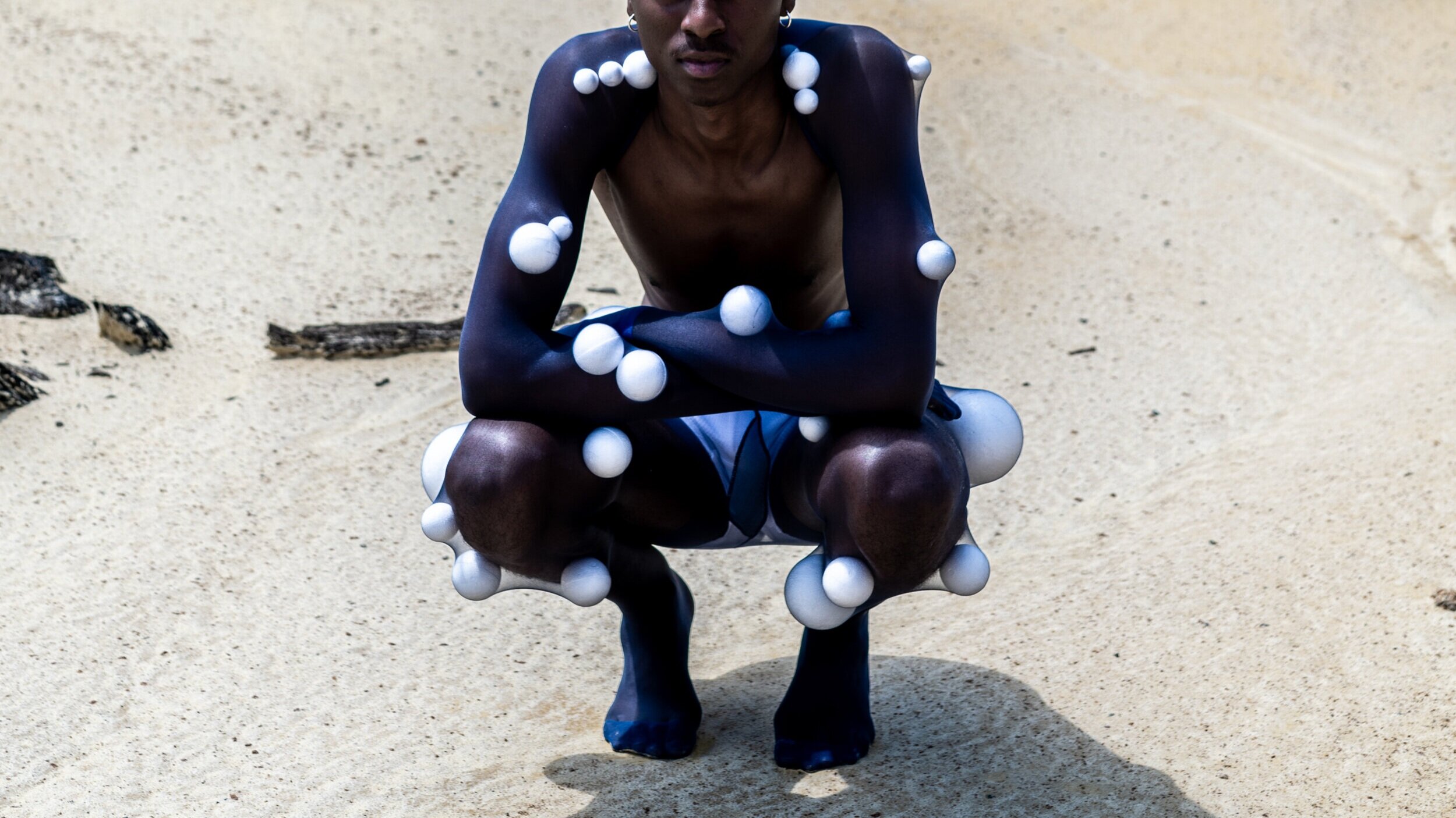
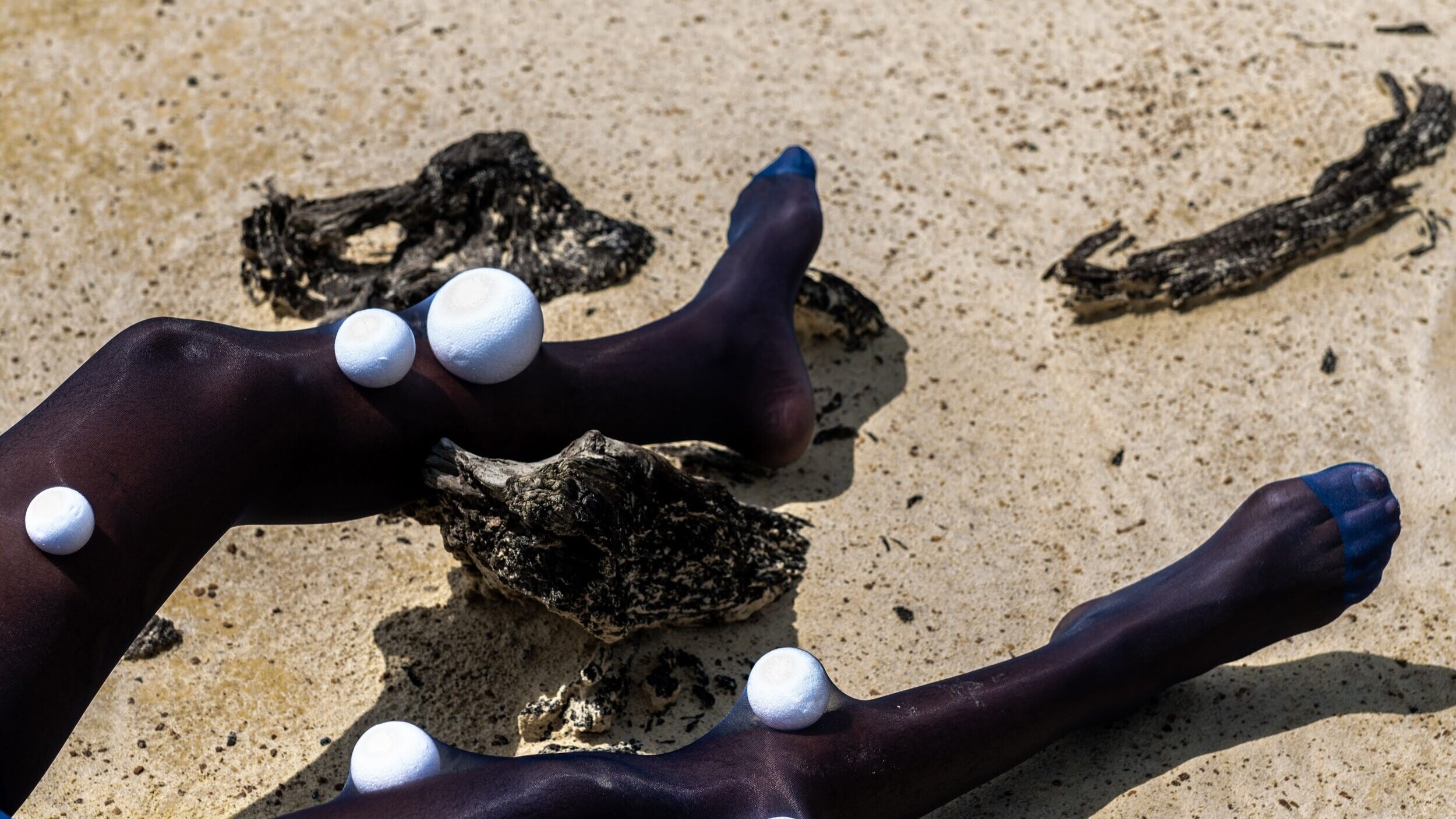
Creative Direction x Anthony Bila | Photography x Kenny Morifi-Winslow
Videography x Mthandeni Nkambule | Models - Tracy Mokgopo + Thabani Mthiyane